It is now estimated that 65 to 75% of people are using their SmartPhone to surf the internet.
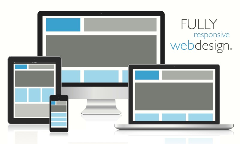
The mobile ready web site is based on what is called a “responsive” design. This means the size and places of images and text responds to the size, dimensions and orientation of the display screen.
All new web site designs by Village Media are based on responsive formats, and we are currently in the process of redesigning web sites for past clients to make them SmartPhone ready.
Responsive Web Site Examples


